
You’ve probably seen the Toyota logo countless times—on the roads, on TV, and even on your favourite social media—but how many of us actually know what those three interlocking ovals really mean?
Turns out, not that many. Social media users have been freaking out over what seems to be a secret message hidden in the logo. But what’s the truth behind it?
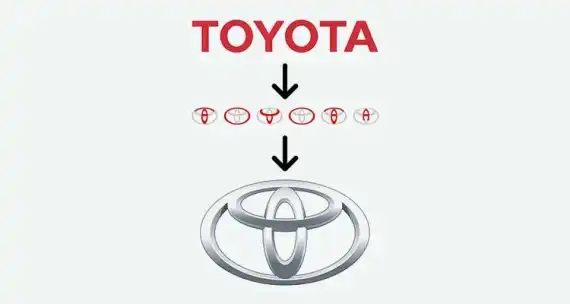
The Toyota logo wasn’t just whipped up in a day. It actually took five years to finalise, and the design was unveiled in October 1989 to celebrate Toyota’s 50th anniversary. And there’s a lot more to it than you might think.
Some TikTok users are convinced the logo represents the letters of the company's name.
One person even said it looked like "a thread passed through the eye of a needle"—a nod to Toyota’s early days making sewing machines. Another person thought it looked like "a circle around the world."
But here’s the real deal: According to Toyota Magazine, the three ovals are carefully arranged to be recognisable from both the front and through a rearview mirror. The two inner ovals overlap to symbolise trust and a mutually beneficial relationship between Toyota and its customers, while also forming a "T" for Toyota. The outer oval represents the world embracing the company.
The design itself draws from Japanese calligraphy, with different stroke thicknesses symbolising the country’s rich cultural art. And the empty space in the background? That’s meant to represent Toyota’s “infinite values”—things like top-notch quality, innovation, and a commitment to safety, the environment, and social responsibility.
In 2020, Toyota introduced a refreshed logo for its European branch, keeping the key elements but adding new typography for a fresh, modern feel.
It all started back in the 1920s when Toyota spun off from Toyota Industries, a machine maker. By 1934, Toyota was making its first engine, and in 1936, it produced its first passenger car, the Toyota AA. Fast forward to today, and Toyota is the world’s biggest car manufacturer.